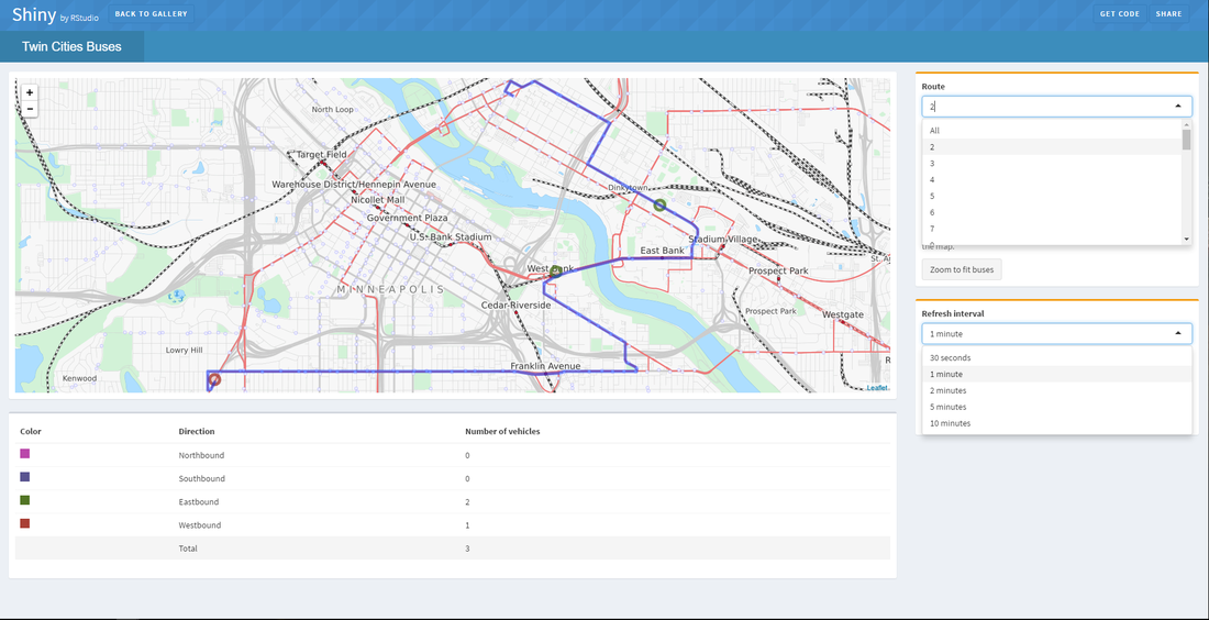
I choose to look at an example of an RStudio Shiny interactive visualization. Since we've used RStudio, I figured I continue to look at more advanced visuals. I choose the "Twin Cities Buses" route visual. I think that these have much stronger impact on people who view that without knowing it. The interaction allows you to customize and personalize it the way you want. The user is essentially creating their own visualization unknowingly. Many variables come into play, but are easy to conduct such as the route number, and the direction of the bus you are looking for. The visualization is an up-to-date, real-time map of the bus routes chosen. The map designates color to each individual bus that is currently running on the map in-real time with the route the user has chosen. Instead of the typical just visuals we have been creating, this puts the power in the users hands rather than eyes and brain to decipher it. I looked over all the quick examples on the shiny.rstudio.com gallery and thought this one gave the most personal feel. I've learned through looking at this one only that extreme amounts of data continuously go into this map rather than one static group of numbers to make one chart. This has refresh rates every minute (or however long you chose) that has numbers always changing within the background data, and visuals always changing on the actual map (bus movement). I hate reiterating things, but the customization alone, having the ability to choose with route is shown, really makes it a a personal visualization. It shows what the user WANTS to see.
 RSS Feed
