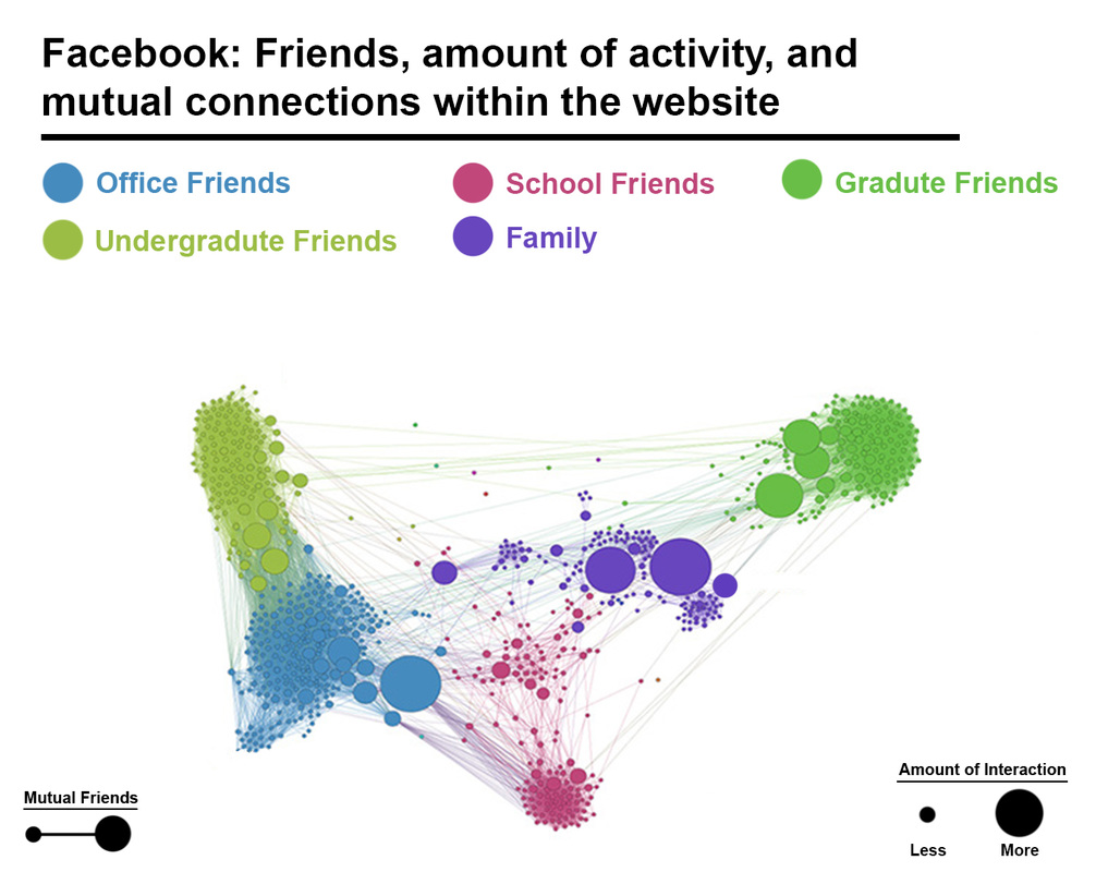
I chose to revise this visual because before it was lacking guidelines to what it was depicting. Before it only showed the name of the grouped colors and that is it. No title, no labels, and had zero additional information within the graph itself. It had to be explained entirely through text and description. Evergreen and Emery guidelines allow the viewer to not have to assume anything. There is captions to explain everything going on within the visual. Going through the five point of the guidelines, I think this one is significantly better than the previous one. I agree for the most part about how to go creating a "perfect visualization" by these guidelines, but my main argument would be to whom the visual is being shown to. If its a general population, I think the more the text and label information given, the better. If it's a select group for a select topic, I think less is more then. I'm a visual learner so I may be bias by saying less is more and simplicity is key, but not everyone learns the same way so Evergreen and Emery have a very well constructed basic layout on how to make a perfect visualization.
 RSS Feed
