
This is a pie chart showing the percentages of different kinds of interest types there were in the Florida Report. It shows that the most common type is "State Master". I chose to do a pie chart to really just show the top 5 largest types in the file because the file is pushing 200,000 inputs, the top 5 largest contributors are the most important anyways. The side bar is listed from most to least so the top five are listed in order; State Master, ICIS-NPDES Non-Major, CESQG, Unspecified Major, and SQG.

This is a line (or area) graph indicating all the other states that were within the Florida report. I could have done a bar graph as well, but bar graphs are boring to me and I liked how this looked. Instead of just putting all the states, including Florida really, I left Florida out because it was such an outlier. Had I left Florida, none of these would have even made a dent in the chart so excluding Florida really allows the viewer to see the different levels per state in which there was a company in the report. No surprise, but Georgia is the next highest in companies reported within the file.
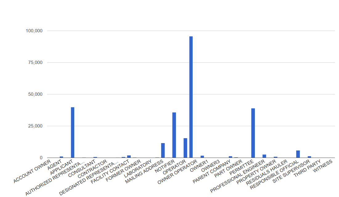
This is a bar graph showing the affiliation in which who is reported the companies actions. Obviously, and I would hope, the owner operator was the one to report the company as generating hazardous wastes. The other three highest, which they should be as well, are the applicant, permittee, and the notifier. This chart could also be a pie chart and may have worked better as one because there are really 7 main affiliates to reporting their companies actions. Regardless, I think a bar chart does it justice as well for the fact it shows so many other options, yet the ones that should report it are significantly higher than all the rest. I think it gets the point across more by having the bars stick out like they do.
 RSS Feed
